Using Font Variant Numeric
The font-variant-numeric CSS property allows us to control alternate glyphs for numbers, fractions, and ordinal markers.

It’s important to note with all font properties, that if the font does not support the variant it will not do anything and will instead fall back to the default. So if you want to use these you have to make sure to choose a font that supports them. I like to use the tool Wakamaifondue as it analyses the font and shows you all the available features.
font-variant-numeric deals specifically with numeric characters like digits - it allows us to control the usage of alternate glyphs for numbers, fractions, and ordinal markers. The related property, font-variant is the shorthand name for five separate variant properties, but in this post I'll focus only on font-variant-numeric.
Fonts will sometimes come with a number of different glyphs that can be used to represent different number formats, fractions etc. But on the web it's not something you see utilised very often simply because it's either forgotten about or not widely known. The font-variant-numeric property allows us to access these features and is particularly useful for product interfaces, admin systems and data where you deal with a lot of numbers.
There are a number of different values for font-variant-numeric you can check out the font-variant-numeric MDN page for a full list, in this article i'll demonstrate some of the options which I find most useful.
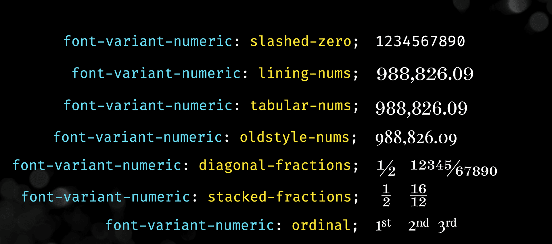
font-variant-numeric: slashed-zero;
font-variant-numeric: lining-nums;
font-variant-numeric: tabular-nums;
font-variant-numeric: old-style-nums;
font-variant-numeric: diagonal-fractions;
font-variant-numeric: stacked-fractions;
font-variant-numeric: ordinal;
Some of these values might seem obvious, something like slashed zero and diagonal or stacked fractions for example, but if you aren't familiar with the terminology something like lining-nums might be confusing. The image below demonstrates some examples.
Some of these might look very different or very similar and when and when not to use them can be confusing so lets take a closer look.
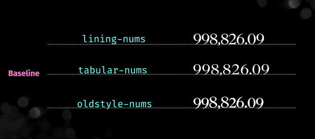
An option like tabular-nums is useful where you want each number to sit on the baseline and take up the same amount space per number - think charts or tables of data where you want everything to align. Whereas lining-nums are better suited to places where the numbers align on the baseline but the individual numbers do not necessarily take up the same space, typically more common in body copy. Finally oldstyle-nums have varying heights and alignments, as opposed to the other two examples which are uniform in height and alignment. They are similar in height to lowercase characters, so you often see this used in body copy as well (though it appears to be less common in more modern fonts).
If we take a look at the image below it has a table with tabular-numson the left and oldstyle-nums on the right. It demonstrates how using tabular nums in this context makes the numbers and data significantly easier to read than the old style nums on the right. Now, the type of font you choose will also play a part in this but primarily the tabular-nums style is easier to read because all the numbers take up the same space and align on the baseline making the reading vertically and horizontally easier to follow.
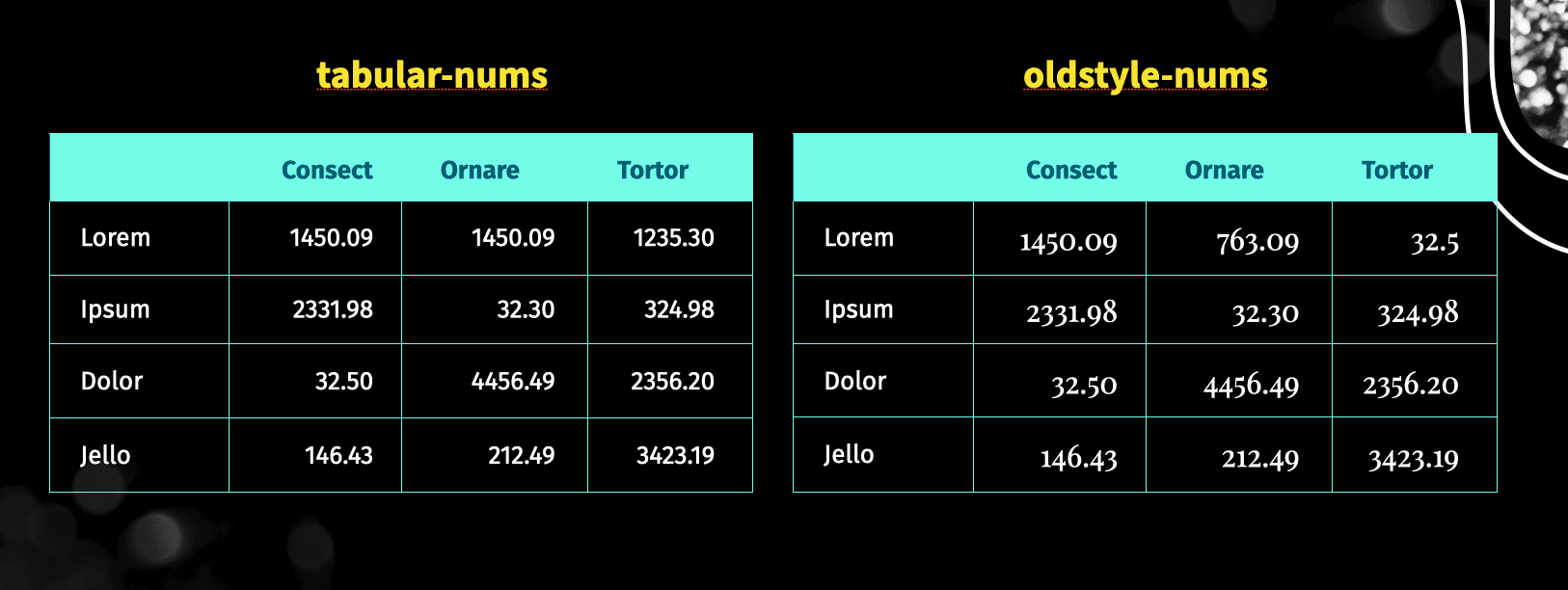
Most modern professional fonts will contain both lining numerals and old style numerals (though not always) additionally they will not always include tabular-nums so if you are dealing with a lot of data in your applications you should absolutely check the availability of this in your fonts before committing at the design phase.
If the font supports it you can also utilise different styles for ordinals (numbers that express position in a series e.g. 1st, 2nd, 3rd) and fractions.
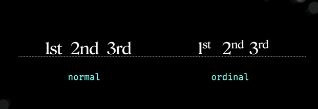
When it comes to ordinals, if you want them to display as an ordinal (kind of like superscript) you can specify the value of ordinal otherwise it will display as regular text as per the image above.
font-variant-numeric: ordinal;
There are two options for fractions, diagonal and stackedthe most common style is the diagonal fraction, however they are typically only available for a common set of fractions, e.g. 1/2, 1/3 etc. Unless specifically requested it's rare for a font to have a variety of combinations. However, the regular set is useful for things like recipe sites. A "Horizontal fraction" is generally considered what you would get by using the forward slash e.g. 1/2. They are harder to read than diagonal fractions, they take up more space, and also, they don't look as good as the pre-prepared diagonal fractions so if you think you'll be needing fractions it's good to investigate what fonts will support your needs.
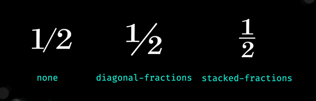
Stacked fractions are even less common and are mainly reserved for mathematical equations, they aren't commonly supported in fonts so you'd really have to look around for them. (As an aside stacked fractions are also referred to as nut fractions which I thought was interesting). These ones if you're wondering are part of the Surveyor Font.
These are only a handful of the options available, so do make sure you check out the font-variant-numeric MDN page for a full list. Most importantly though, you can combine the options by specifying multiple values at once. For example, you could set tabular-nums AND diagonal-fractions with a space separated list.
font-variant-numeric: tabular-nums diagonal-fractions;
While this is supported in new releases of the browsers, depending on how far back you need to support you may need to include the font-feature-settings property. Each option is mapped to an Open Type feature, in this case, frac === diagonal-fractions. You can find these values on the font-variant-numeric mdn page. Please remember though that while font-feature-settings will accomplish the same thing, you should use the font-variant property wherever possible as it will lead to more effective, predictable and understandable results. The same applies to using any of the font-variant properties.
What's unfortunate though is that even though many devs may be familiar with the CSS property I think they assume it will just work with whatever font they are using, and when it doesn't they ignore the feature. However it's definitely worth checking if alternate versions of your chosen font support the feature or if you are in the design phase considering how you want numbers represented and choosing fonts which support these methods. font-variant-numeric is a great property to keep in mind if you're dealing with a lot of data, especially if you're finding people are struggling to understand your content. Sometimes changing the font, or the way it's displayed can make a significant difference to the users understanding of what we are trying to convey.