The problem with data-attributes for text effects
Data-attributes are a simple and easy way to create layers for text effects on the web, but they are problematic for accessibility.

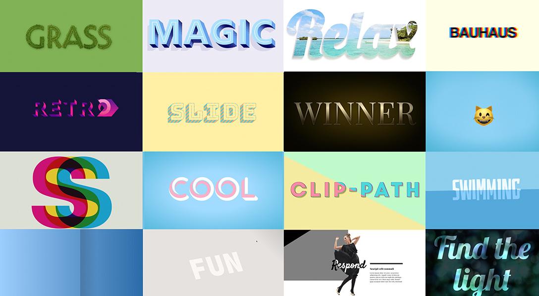
As a lover of CSS Text Effects I love seeing posts and demos showing fun and cool text effects, but I wanted to do a quick post on the technique of using data-attributes and the CSS content property to create layers and why it can cause problems for Accessibility.
I'll be the first to admit, I used to do this, in fact, some of my Text effect demos still use this technique (I'm in the process of updating them). I even did a talk about it way back in 2018.
The technique is fairly simple, instead of having multiple HTML elements on the page, you can use one and then add a data-attribute with a copy of that text.
<h1 data-text="Jello">Jello</h1>
From here we can then use CSS pseudo-elements and the content property to create an additional layer, this will add a copy of that text in our page and give us the ability to style it however we want.
h1::before {
    content: attr(data-text);
}
This technique is used primarily to create layers for creating effects as you can stack copies on top of each other without the need for multiple HTML elements. This seems great, because it keeps our HTML cleaner and simpler. But the problem with this is that some Screen Readers and other assistive technology will read out the text from the data-attribute used in CSS Content, which means users get the "joy" of listening to the text multiple times.
We'll use this Candy text demo from Codepen for the first example. It has one h1, a data-attribute and two pseudo-elements with content property referencing the data-attribute. It's using Macs Voiceover Screen Reader.
The screen reader reads "Heading Level 1, 3 items, candy candy candy", which is super annoying. The whole point of using data-attributes and the content property is to create one element of text. This does not apply for assistive tech, meaning, it's not working as intended. At this point we have two options for resolving this. The second option does allow us to keep using the data-attributes but we'll look at the option with the most support first.
Multiple HTML Elements
Create multiple HTML elements and use the aria-hidden attribute to ensure the copies are not read by a screen reader, and then style accordingly. I usually nest them because it makes layering a bit easier, but you don't necessarily have to do that. This will work in all browsers so support is not an issue.
<h1>
    Jello
    <span class="layer1" aria-hidden="true">Jello</span>
    <span class="layer2" aria-hidden="true">Jello</span>
</h1>
For demo purposes, your text effect will now, thankfully, only say Candy once. A much better experience across the board.
Use the CSS Content Alternative Text feature
The feature has been kicking around in Chrome since about 2019, with mixed support across the board and it's currently still not supported in Firefox so personally I think using multiple elements is still the best choice to ensure support.
However, this approach, in my opinion, is a lot simpler, so lets take a look, and hopefully Firefox will support it soon. We'll use "the Frozen text" demo from Codepen and below you can see the video where it reads out the text three times. (I had this video on loop and, oh my, that was frustrating).
The approach is the same as what I showed above with the data-attribute and CSS content property referencing our data-attribute. The difference is that we will also provide alternative text for the screen reader. In our case, we want it to be empty.
h1::before {
    content: attr(data-text) / "";
}
By applying the alternative text with the content property, it now will only read out the text once, and ignore the text in the content property. The reason this works is that the "alternative" text feature is essentially intended to allow us to provide better more descriptive text for things like Icons. So if you used the content property to add a cross icon, you could add alternative text of "Close". In our case however we are setting it to blank essentially telling the browsers that our content is only meant for decoration and can be ignored.
There used to be an issue with Safari having a different syntax for the alternative text, but I tested this and it does not appear to be a problem anymore, the above code worked fine, so I am assuming the browsers have all aligned on this.
Overall, the second option would be better on all fronts, we could have the benefit of simpler HTML without the accessibility issues. However due to it's lack of support in Firefox I wouldn't currently recommend it and instead suggest the first option until it's supported across the board. If you're interested in the status of this you can check out the open bug.
I have also not tested it with other screen readers as I don't currently have access to them so I can't guarantee it will work everywhere.
Whatever we create for the web should aim to be usable by as many people and technologies as possible so by making sure your text is accessible you will end up with a much better functional user experience whether you are using assistive technology, or not.
Also, I am sorry for all my Codepen's that are currently really annoying for accessibility I promise to update them.
